JavaScript is required for our website to function.
Please disable any browser extensions that block JavaScript from loading.
JavaScript is required for our website to function.
Please disable any browser extensions that block JavaScript from loading.
A landing page is a standalone page designed to communicate a well-defined message and persuade visitors to perform a specific desired action. That action might be joining an email list, signing up for a free product trial, downloading a whitepaper, buying a product, or clicking a call-to-action (CTA) button. It’s called a landing page because visitors “land” on it from various marketing channels such as email campaigns, search engines, content marketing campaigns, or advertisements.
A landing page can exist as a part of a website or as an independent page. Either way, its success is measured by the percentage of visitors it persuades to take action.
Businesses use landing pages throughout the sales funnel to collect visitor information or make sales. The most common reasons for using landing pages include the following:
But what do landing pages offer that you can’t do with your regular website? Why do you need to create a separate page to drive action from your visitors? And what does an effective landing page look like?
In this article, we’ll answer all those questions and share landing page examples to help you understand how businesses use them to achieve marketing goals. Before you dive in, though, watch the video below for an easy-to-understand introduction to landing pages.
Check out this brief video about landing pages to learn more
A landing page is primarily designed to convert visitors into subscribers, leads, or customers. But it cannot achieve this goal on its own. Instead, it’s one stage of the conversion process, with various marketing channels, assets, or platforms before and after it.
For example, traffic generation through search engines, email, social media, or pay-per-click (PPC) usually happens before the landing page. And once a visitor reaches a landing page, they’re transferred to the next stage, which could be an email list, a waitlist, a checkout page, or a product trial, through a CTA button.
Landing pages are usually integrated with a CRM, email marketing, or marketing automation solution to gather visitor information and collect leads. However, to make a landing page work, you need to ensure all the other steps of the conversion process are also in place.
Landing pages offer numerous benefits to marketers and businesses of all sizes. Let’s discuss some of the most significant benefits of using a landing page.
Landing pages are excellent tools for converting traffic into subscribers, leads, and customers. In fact, an effective landing page exists for the sole purpose of persuading its visitors and target audience to perform a specific action.
The content of a landing page is fully aligned with its conversion goal. This is why it minimizes distractions by removing the header, footer links, and other page elements that do not directly contribute to its conversion goal.
Landing pages offer an opportunity to demonstrate your brand’s value. Unlike blog content, where you cannot be overly promotional, your own landing pages allow you to highlight your brand’s strengths and feature customer success stories, case studies, and testimonials to demonstrate your credibility.
Modern marketers use retargeting scripts from Facebook, Google, and other ad networks on their landing pages. This allows them to show targeted ads to the visitors who leave their landing page without taking action in an effort to increase the likelihood of those visitors returning and converting in the future.
Landing pages are valuable marketing assets. Even when you’re not using them in a marketing campaign, they can drive traffic through search engines and referrals, helping you passively gather leads and strengthen your brand image.
Landing page tools offer excellent audience insights that allow you to polish your offer keeping your audience’s needs in mind. For example, you can find the regions where your audience is based, their devices, preferred social networks, and the search terms they use to find you. You can also track audience behavior on your landing page and improve its content with landing page builders based on your findings.
Marketers use various landing page types to achieve specific business goals. Let’s take a look at the most popular landing page types.
A squeeze page is the most commonly used to convert visitors into email subscribers. It doesn’t contain much text content and persuades the visitors to sign up by pitching a free lead magnet such as an ebook, newsletter, or video training program in exchange for their email address.
B2B companies use lead capture pages to attract qualified leads to their email lists. They’re similar to squeeze pages but usually have more detailed forms to gather information.
A sales page is designed to sell a product by highlighting its benefits and connecting its features with the audience’s problems.
Long-form sales pages are used for selling high-ticket offers and more sophisticated products that require more persuasion to convert unsure visitors into buyers. Their goal is the same as a regular sales landing page, but they contain more detailed and conversational content in multiple formats (text, videos, images, tables, and charts).
People often get confused about the difference between a website’s homepage (or product page) and a landing page if they don’t understand the definitions of the two types of pages. And, if a business doesn’t have a mature marketing strategy, it may use them interchangeably.
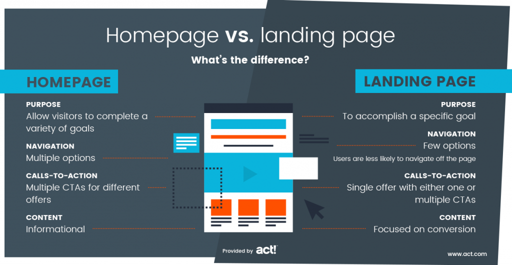
However, landing pages and homepages have significant differences. For instance, homepages are typically built to enable a large variety of interactions. The user could visit to buy a product, find more information about the company, search for contact information, or even look for job openings. A homepage will typically make it possible for users to achieve all these goals.
On the other hand, most website visitors will have the same reason for visiting a landing page. As such, all the features are optimized to facilitate this goal. This typically results in a few key differences.
A homepage includes a variety of menus that make it easy for users to find the information they need. Meanwhile, a landing page often avoids menus altogether, giving users fewer chances to navigate away from the page. The goal is to make clicking the CTA button the only option.
Content on a homepage reflects that the user could be there for multiple reasons. The content is typically informational and attempts to tell the visitor about the company and its operations.
On a landing page, the content focuses on conversion. For example, an ebook landing page will communicate the benefits of downloading the material, while a free-trial page will show the benefits of signing up.

A call to action is a feature on a webpage that invites the visitor to perform a specific task. It will often be in the form of a clickable button. Examples of CTAs include “learn more,” “buy now,” or “sign up here.”
While both homepages and landing pages use calls to action, they do so in different ways. A homepage will typically have multiple CTAs to satisfy a variety of goals. For example, it might encourage the user to find out more about product features, sign up for an email subscriber list, or access a free trial.
A landing page will usually have a single CTA (or multiple calls to action for just one offer), as including more would reduce the chances of the page achieving its primary goal.
Our landing pages on-demand webinar shows you how. See landing pages in action, including landing page examples, templates, and more.

Landing pages are a critical part of a digital marketing campaign. You need a landing page if you want users to take a specific action at any point in your plan. While you can use a generic web page, a landing page provides the best possible chance of conversion.
Specific examples of how a landing page fits into a marketing campaign include:
If you want to use PPC advertising on Facebook, Google, TikTok, LinkedIn, or any other platform, you need to combine it with a relevant and conversion-optimized landing page.
Why? Because most ads generate interest in your offer but don’t provide prospects with specific details of how it solves their problem. That’s the job of a landing page. If you send your ad’s traffic to a generic website page, your prospects won’t get the answer they want and will not convert.
If you want to build an email list, the best strategy is to place a lead magnet like an ebook, newsletter, or any other free resource on a landing page and ask your visitors for their email addresses in exchange for access.
People are reluctant to share their contact information without a strong incentive. With a compelling lead magnet on an eye-catching landing page, you can grow your email list much faster.
You can use landing pages in several ways to boost sales. For example, create dedicated product pages that contain a product’s images, reviews, features, and benefits to convince buyers.
Similarly, product-specific landing pages can drive sales through social media or email marketing campaigns. You also have the option to create dedicated landing pages for your top traffic channels and use consistent messaging to drive conversions.
Free trials are a great way to give users a taste of your product and persuade them to upgrade their subscriptions. Once again, landing pages are an excellent tool to drive conversions here. With an optimized landing page, you can convert your traffic into free trial sign-ups using CTA buttons and persuasive copy.
Webinars are an extremely effective channel for driving sales for software and high-ticket digital products. However, to attract webinar attendees, you need an optimized landing page that not only pitches your webinar’s main benefits but also creates urgency through convincing copy.
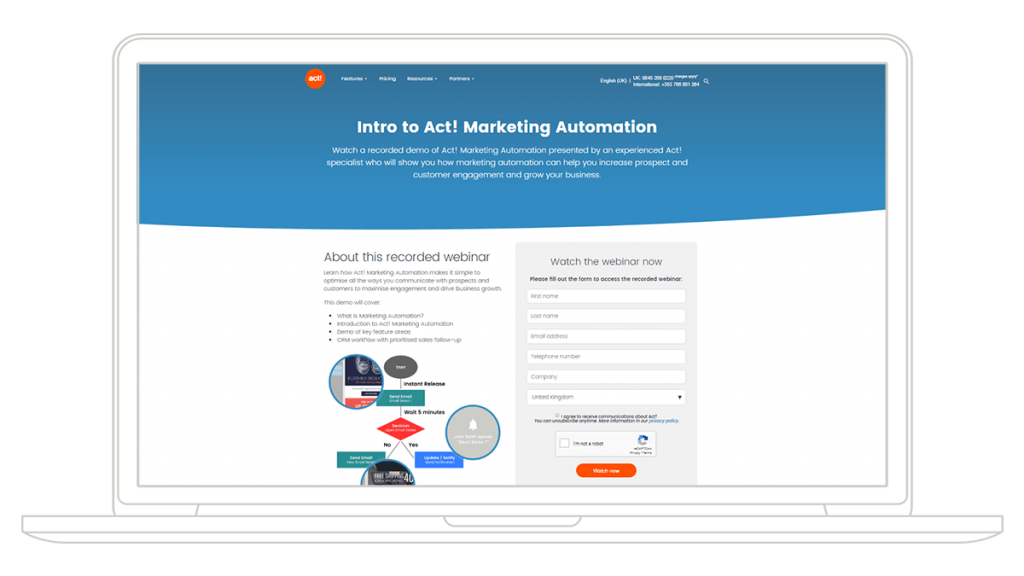
Although there are different types of landing pages, a good landing page usually has several features that make it convert well. Let’s look at the landing page for our marketing automation webinar so you can see how these parts come together.
Other features you can use on your landing page include:

Using videos on landing pages can improve your conversion rate by 86%1.
Now that you know the features of a landing page, you need to learn how to put them together in a way that converts. Here are some things to consider.
Know your offer
Before creating your landing page, know your offer and its benefits. For example, if your landing page pitches a free ebook, show visitors how downloading it can solve their problems.
Know where the landing page fits in your strategy
You should also have a clear idea about which stage of the marketing funnel the landing page is for. If it’s designed for the awareness stage, you can talk about how your ebook will teach the prospect something useful about their problem. If it’s made for the consideration stage, show how the offer will help them make a purchasing decision.
Match your messaging
Ensure that your landing page messaging matches the messaging of the content that sent the user to the page. Here are two examples of this in practice:
Know your customer
You need to have a clear idea about who your customers are so you can tailor landing page content to fit them. For example, a local cleaning service that offers separate home and office cleaning services should use a different landing page for each type of customer. As potential customers will typically only visit your landing page after taking a particular action, it’s easy to make accurate assumptions.
Ask for minimal information
Lead-form abandonment occurs when a prospect stops signing up for your offer before they finish. This usually happens because the process is complicated or you asked for more information than they are willing to provide. To reduce the chances of prospects abandoning, consider asking for the minimum amount of information possible. You can always find out more by requesting it later or using an external source of data to fill in the gaps.
Put important information above the fold
The fold refers to the part of the screen that is visible when you first land on a page. You should optimize your landing page so everything a customer needs to make a decision is visible on this part of the screen.
Optimize for mobile
A significant amount of web traffic comes via mobile, so you must ensure that your landing page is optimized for both desktop and smartphone browsers. This will improve user experience and give you the best chance of converting, no matter how the user accesses your site.
Try Act! free for 14 days and see how Act! Marketing Automation helps you create great landing pages that increase conversions.
