When we think of digital marketing, we tend to focus on all the ways to increase awareness and drive traffic to our websites. Of course, activities such as search engine marketing (SEM), banner ads, social media advertising, and email marketing are essential to any marketing strategy.
But that’s just the beginning.
While it’s important to rack up likes and shares and improve click-through rates, what do you do with all that traffic once it gets to your site?
That’s where landing pages come in. In this blog post, we’ll explain what they are and why they are so critical to converting web traffic into real customers.
Why are landing pages so important?
Landing pages aren’t just a place for readers to ‘land’ after clicking on your ad or email link. They are crucial to helping you to achieve a certain goal through a voluntary opt-in process. Maybe you want the reader to sign up for your newsletter, take advantage of a discount on pricing, or attend an event.
Whatever your goal, you should strive to attain high conversion rates with every landing page you create. In other words, the reader should want to take the action presented to them, such as entering their contact information, submitting testimonials, or making a purchase.
How do landing pages help your marketing strategy?
Successful landing pages do more than just increase conversion rates. Here are some other key benefits:
Boost your SEO ranking
With a little research, you can design an effective landing page that targets a specific set of search engine optimisation (SEO) keywords. You can also use paid searches to boost your ranking using Google Ads and other methods.
The goal is to move your web page up in ranking so it appears higher in the search engine results page (SERP). This ultimately drives more potential customers to your website.
Create custom lead capture pages
Whenever you have something to promote, such as a new product, sale, or job openings, you can create a landing page that exclusively focuses on that single promotion (instead of sending visitors to a generic homepage).
Here’s how that helps you:
- Fast-track landing page conversions for any target audience, such as customers, prospects, job seekers, etc.
- Set up landing pages to track the success (or failure) of a particular marketing campaign, pay-per-click (PPC) ad, social media post, and more.
- Gather valuable marketing intelligence needed to make changes and apply your learnings to future initiatives.
Streamline the user experience
The faster you move prospects and customers through the marketing funnel, the better. By directing relevant traffic to a landing page, you have a much better chance of converting them through a CTA that instantly directs them to subscribe, sign up, buy, or join.
Watch this webinar to learn how to create landing pages.
8 Tips for Creating High-Converting Landing Pages
If readers are abandoning your website in large numbers, now’s the time to understand and apply these essential landing page best practices:
- Give the reader one easy action to complete
- Make the CTA button pop
- Provide a consistent user experience
- Decide between text-based or video content
- Don’t confuse landing pages with blog posts
- Ensure your landing pages are fully optimised for mobile
- Send a quick confirmation
- Track their point of origin
1. Give the reader one easy action to complete
Let’s say your social media campaign generated a lot of click-through traffic – congratulations! Unfortunately, you discover a high bounce rate after they arrive. A number of things could be the cause, such as:
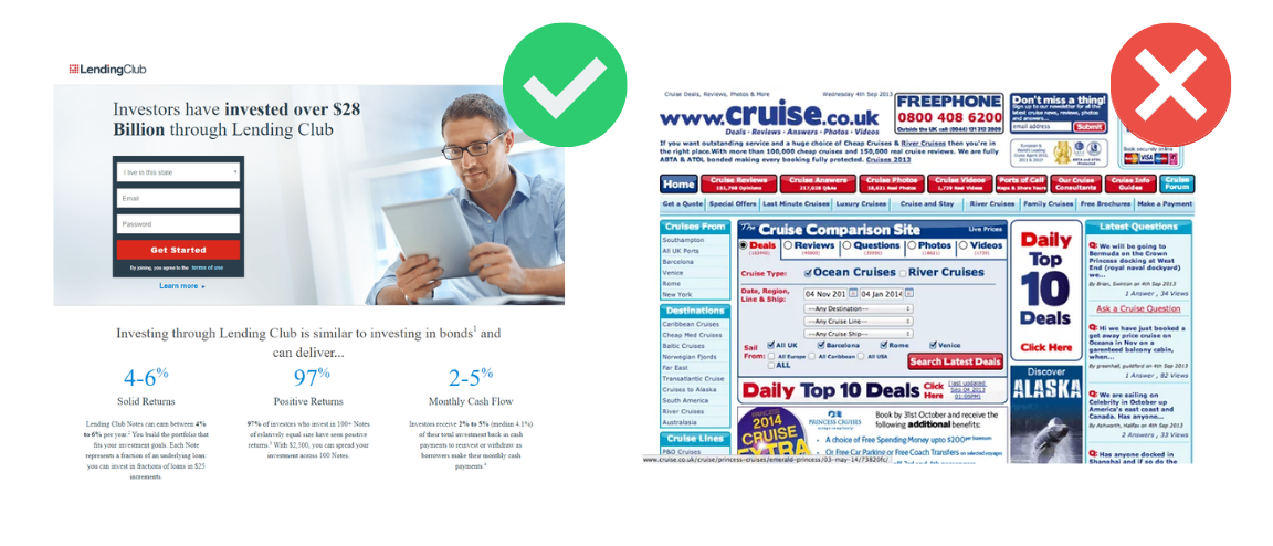
- Too many calls-to-action (CTAs). You tried to ‘stuff’ the landing page with a lot of options that overwhelm the reader. For instance, maybe there’s a free trial offer, a newsletter signup, an event promotion, and a purchase discount all on the same page. Your landing page needs to be limited to one CTA, such as an email contact form.
- You require too much information. Restrict how many form fields you include on your lead capture forms. It can be tempting to ask for too much personal data, such as first and last name, address, phone number, company name, etc., which tends to drive prospects away. Remember, you want to build trust over time, so don’t ask for too much too soon.
- Disorganised layout. Users are more than likely to abandon a landing page design that’s cluttered with images or long paragraphs of text. Nowadays, it takes less than one second for a reader to decide if they’ll stick around on your site or jump ship. Create a user experience that makes it easy for them to engage with you.

2. Make the CTA button pop
Along the same lines, you want to make sure that the CTA is clear, concise, and ties back to the ad or link that directed the reader to your page. You also want to design it to pop off the screen using contrasting colours (vs. an annoying pop-up ad) to grab a visitor’s attention. Never force the audience to scroll down the page or search around for the CTA button.
Start the CTA with an imperative such as ‘Get’ or ‘Join’ so the action is crystal clear to the reader.
Some examples of effective CTAs include:
- Join our Team
- Book an Appointment
- Get a Quote
- Sign Up for Our Newsletter
- Enter the Contest
- Start Your Free Trial
3. Provide a consistent user experience
It might seem obvious, but you’d be surprised by how many landing pages fail to sync with the source page, such as an ad or social media promotion. For instance, a user might click on an ad that promotes free shipping, but when they arrive on the landing page there’s only an option to sign up for a newsletter. This inconsistency can leave the visitor feeling tricked, frustrated, and definitely less likely to trust your brand.
Not only does the message need to be consistent across the marketing chain, so should the look and feel of your website. For instance, you can design the hero image on your landing page to match the product or service promoted in your ad.
Without these guideposts, potential customers may think they ended up in the wrong place, hesitate before proceeding, and ultimately abandon your website. By ensuring consistency, you can avoid many of the pain points that lead to a poor user experience.
4. Decide between text-based or video content
You only have a couple of seconds to grab your visitor’s attention. This means you need a very good understanding of your target audience in order to craft your landing page content.
For instance, if you simply want to capture the visitor’s email address, you want that form to be highly prominent. Likewise, you want to remind the user why they landed on that page, whether it’s to access a promotion or register for an event.
On the other hand, if you have some short videos, such as customer case studies, then video might be the way to go. Be sure to end your videos with a clear CTA, not just a product promotion. Keep in mind that video can delay page load times, which in turn may impact your Google SEO ranking.
Don’t let that dissuade you, however. Unbounce found that video can significantly boost engagement and conversion rates, so video landing pages may be worth considering (along with best practices to give the user the best possible device experience).
5. Don’t confuse landing pages with blog posts
Remember, landing pages are designed to achieve a single goal – which is to get the reader to take a certain action. It might be tempting to serve up additional content about upcoming events or the latest news about your company, but this can distract the visitor from your main goal of improving conversion rates.
Don’t try to ‘sneak in’ lengthy editorial or educational content that’s better served by a blog format. It’s best to keep landing page copy restricted to brief text snippets such as headers, subheadings, relevant value propositions, short bullet points, and, of course, the CTA.
Of course, sometimes longer landing page copy is acceptable, as in the instance of a highly technical audience that wants in-depth content before registering for a conference. Again, this all depends on the purpose of your landing page and your target reader.
6. Ensure your landing pages are fully optimised for mobile
Mobile optimisation delivers the same user experience regardless of the device or screen size. It ensures that your target audience can easily access and view your website from a phone, watch, tablet, or desktop.
Your pages should also be optimised to reduce load times and offer a clean and efficient design that’s easy to read and navigate. Google now factors page experience into its SEO algorithms, which is another reason to ensure your website is optimised for mobile devices.
7. Send a quick confirmation
Don’t leave your new leads wondering if their request were received or what they should expect from you next. Once they submit their information on the landing page, confirm that you received their submission with a quick note at the top of the page and follow up with an email. Again, keep it simple with something like, ‘Thanks for signing up! You’ll receive an email confirmation shortly.’
You can also send the visitor to a confirmation thank you page where you can further engage them with additional content. This may even prompt them to take the next step in their buyer’s journey!
8. Track their point of origin
You may be promoting the same lead generation content through various channels such as email lists, social media, and paid ads. This makes it important for you to track key navigation metrics so you know which sources are generating potential leads as well as which of them are converting most consistently. This will help you continuously improve your marketing results through methods such as A/B testing.
Act! can help you create great landing pages!
Don’t settle for good landing pages. With Act!, you can build high-quality landing pages that consistently capture and convert new leads. Our all-in-one CRM and marketing automation platform allows you to choose from a library of easily customisable templates that get you up and running fast.
No separate landing page builder necessary!
Plus, we offer highly competitive pricing that gives you affordable access to advanced email marketing and integrations with top productivity solutions such as Calendly, Zoom, DocuSign, QuickBooks, Microsoft 360, Google Workspace, and more.
